Now that I have some time to work on my blog again, I decided to do some exploratory analysis using data from the Philadelphia Eagles' 2015 football season. As a displaced Philadelphian, it pains me to see them do poorly. That pain is even worse since I walk through the city of an NFC rival team (Washington, DC).
Regardless, this past season was a bit rough, so I found some data and started poking around using R. The data comes from Sports Reference, which has a very good collection of data for football, baseball, basketball, and hockey.
Prior to the season's start, the Eagles were the projected NFC East Champions with a team that, at least "on paper", showed a lot of promise. With a final record of seven wins and nine losses (7 - 9, 0.438 win percentage), the 2015 season was certainly a disappointment.
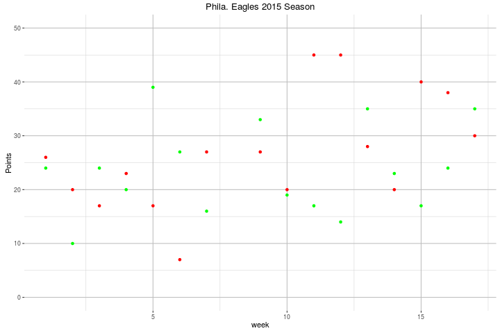
This first graph is a simple scatterplot of their season. The red dots are their opponent's score, and the green dots are their own score.
To break things down a little more, the next two graphs are bar graphs showing the Eagles' Points For and Points Against, with a horizontal line showing the average points for each graph. Also, the bars are colored according to the games result: green for a win, red for a loss.


Finally, to illustrate some of the interaction I created the following two scatterplots that show the interaction between Offensive Yards Gained and Points For, and Defensive Yards Allowed and Points Against:


This was just a quick visualization of the the Eagles 2015 season. A more detail analysis would include a break down of offensive and defensive total yards into their component parts (passing and rushing), and additional variables such as penalties and turnovers.
