- My family and I have moved, and our former home has been sold;
- I stopped taking classes at UMUC, a combination of not having enough of either the time or the money necessary;
- I am looking for a full-time, permanent job in the Philadelphia area; and,
- the boys take up a lot of my free time.
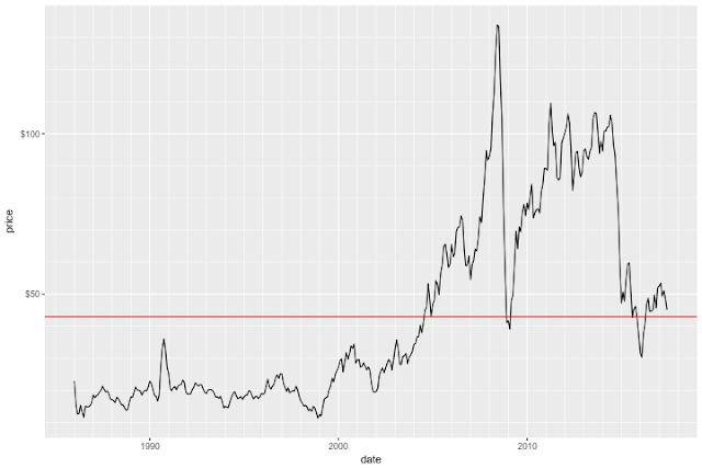
Note: red line is average price over the series.
I found this to be an interesting way to look at oil prices. It shows the annual variation in the per-barrel price of oil as a boxplot, with the overall average price imposed by the red horizontal line:
If you can ignore the change of price in the last ten or so years, the thing that may catch you eye -- as it did mine -- was that many years don't have much volatility in the price, with the obvious exceptions of 2007 through 2009.
As usual, my R code is in my GitHub repo.
More posts will follow, as I strive to make more time to express myself. I would like to do a follow up/finishing post on the voter data. Plus, I want to explore and analyze some other data of economic/financial significance.
Stay tuned.


