Sunday, July 26, 2015

Using RPubs To Publish Work

I need to apologize to anyone who is actually reading my blog.  I had every intention of publishing a follow up post about Greece -- comparing its 10-year bond rates with those of the other "troubled" EU countries of Spain, Italy, and Portugal -- but life got in the way a bit.

This post will be a brief explanation of my current course.  I'm currently in the Reproducible Research course in the Data Science specialization certificate offered through Coursera.

One of the assignments in this course has me working with a particularly messy dataset.  After downloading the data, cleaning it up, and performing some exploratory analysis, I published my findings to RPubs.com.

Here is a link to my report.  It's nothing fancy, but I'm proud of it. 

This was created using the knitr package that integrates nicely with RStudio.  It allows you to create markdown documents that are easily viewable in HTML, as well as publishing them to RPubs, which is maintained by the folks who created and maintain RStudio.

knitr can also create documents in .doc and .pdf format as well.  I recommend trying it if you're in a data analysis role in any compacity.

For now, I'm going to leave off here.

Update 11 December 2015: Due to RPubs documents being public, and not wanting to tempt others who are taking the Data Science specialization through Coursera to copy my work, I have removed the report from RPubs.  I apologize for the inconvenience.

Friday, July 10, 2015

Exploring Greek 10-year Bond Rates

I want to start this blog post with a few notes:
  1. I received some feedback and updated the third graph in my previous post to include a label for the y-axis.
  2. I plan to make my R scripts, data, etc. available through my GitHub account at a later date
  3. I will be adding links to blogs that I follow and websites that I find useful and visit often.
  4. I am hoping to post up something new every other week, but I am not making any promises on creating a schedule for publishing.
This post is the result of a conversation I was having with a coworker.  We were discussing the continued financial woes of Greece when he looked up the Greek 10-year bond rate.  It was not extraordinarily high, giving it recent history.  So, I decided to look up the data through Quandl and see what was available.  I had free access to a premium data set, and pulled the data straight into R using the "Quandl" package.

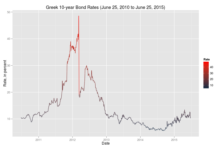
First, here is a historical look at Greek 10-year bond rates:


This plot was made using the "ggplot2" package.  Current rates (around the 10% range) are not particularly bad when compared to 2012 and 2013.  It did appear to have a steep increase from the beginning of 2015 to the last observed data point.

Then, I created another plot using a narrower time frame to focus on more recent events following the 2008 financial crisis:


These plots (and their data) made me wonder if the market was really reacting to the problems in Greece.

The caveat to these plots, however, is that the last captured observation was June 25, 2015.  Quite a lot has happened since then, so I went to Investing.com and pulled data for the trading days of June 25, 2015 through the close of business July 10, 2015:


We can see that there was a jump in the Greek 10-year bond rate that corresponds to the referendum that took place, and the market's reaction to the referendum's outcome.

I took this data and then combined it the data I retrieved from Quandl and created this final plot:


I started working on this blog on Tuesday, and was hoping that Quandl would have updated data -- I am slightly hesitant to append one (very small) data set to another that come from two different sources.  Investing.com's data is not formatted for download.  I had to manually collect the data from their site in order to create that data set.

Regardless, it leads to a few questions:
  1. If rates are a sign of risk, how worried was the market in the Greek referendum?  (The spike is less than half of the larger spike in 2012.)
  2. How will this weekend's continued negotiations affect Greek bond rates?
  3. Like everyone watching events unfold, what would happen if Greece left/were removed from the EU?  Or stopped using the Euro and reintroduced the Drachma?
Continued research could answer those questions.

Sunday, June 28, 2015

First Post

I'm trying to blog in order to exercise my R skills and as an outlet for my own interest in data analysis... or data science, since that's the new "buzz term".

I'm using R (currently, version 3.2.1) and RStudio (currently, version 0.99.441) on an "aging" Acer Aspire TimelineX laptop running Linux Mint 17 'Qiana' for its operating system (OS).

So, for my first post, I'm analysing data that I had previously looked at using Stata12.  Since migrating to R, I'm finding that the graphical output is much better.  Please note that the following graphs are using the base graphics package.

My first plot is Weekly U.S. Retail Gasoline Prices:


Followed by Weekly U.S. Total Stocks:


These are exploratory graphs.  I am just viewing the data.  The price data will probably show a strong correlation with oil prices (which I will show in a later post).  The stock quantities graph looked interesting, so I created a more detailed graph using the 'ggplot2' graphics package:


There was an interesting decrease in the quantities of gasoline stocks that began around 1992 through 1996.  Quantities of gasoline stocks did not show an increase until 2007.  This may be worth exploring further.
Creative Commons LicenseJust A Data Geek Blog by Richard Ian Carpenter is licensed under a Creative Commons Attribution-NonCommercial-ShareAlike 4.0 International License.