Saturday, June 9, 2018

Moving The Blog

I have decided to move my blog from Blogger to Netlify.

I am a fan of Blogger, it's a great way for people to get themselves online.

I am a bigger fan of R.  I use it regularly.  I never liked having to jump through hoops to format R output to fit in Blogger.

With the 'blogdown' package by Yihui Xie, I can now build posts in R through RStudio, using Hugo.  The compiled files are then saved to my Github repo, and Netlify automatically updates within seconds.

So... the old content will be slowly migrated.

... and the new www.justadatageek.com is now live!

Saturday, May 19, 2018

A(nother) Brief Update... Again...

It's been a while and a lot has happened:
  1. I found full-time employment as a data analyst.
  2. My wife and I purchased a home.
  3. I've finished my master's degree program and graduated.
Now that I have some space and time, I am working on a blog post a bit more interesting than this one.  The plan is to post up at least monthly.  I'd like to post something every other week but I'll (re)start slowly to build up topics, do research, analyze data, and then write.

So... stay tuned!

Tuesday, November 28, 2017

A(nother) Brief Update...

Just to keep things moving, even only slightly, forward with my blog...

I'm still looking for a full-time, permanent job in the Philadelphia area.  I didn't imagine that it would be this difficult, but it would seem that transitioning my skills and experience as an Economist with the Federal government isn't as easy as I thought it would be.

I'm also still working on completing my graduate program, which seems to be going decently well.

This post was originally going to be a continuation of the voting statistics blog that I did in October 2016 has been rendered unnecessary.  The U.S. Census Bureau published an outstanding analysis piece on their website.

So, given all of that information, I am going to look for other economic/finance topics to work on for my next full blog post.

I expect to begin blogging after the fall semester ends and my work load lightens a bit.

I wish everyone a safe, fun, and happy holiday season!

Friday, July 21, 2017

Quick Update And A Graph About Oil Prices

It has been rather hectic of late:
  1. My family and I have moved, and our former home has been sold;
  2. I stopped taking classes at UMUC, a combination of not having enough of either the time or the money necessary;
  3. I am looking for a full-time, permanent job in the Philadelphia area; and,
  4. the boys take up a lot of my free time.
So, I am getting back into the blog slowly with this quick personal update, and (what I think is) a nifty little visualization of oil prices.  I'm sure everyone is familiar with the line chart:

Note: red line is average price over the series.

I found this to be an interesting way to look at oil prices.  It shows the annual variation in the per-barrel price of oil as a boxplot, with the overall average price imposed by the red horizontal line:


If you can ignore the change of price in the last ten or so years, the thing that may catch you eye -- as it did mine -- was that many years don't have much volatility in the price, with the obvious exceptions of 2007 through 2009.

As usual, my R code is in my GitHub repo.

More posts will follow, as I strive to make more time to express myself.  I would like to do a follow up/finishing post on the voter data.  Plus, I want to explore and analyze some other data of economic/financial significance.

Stay tuned.

Friday, January 6, 2017

A(nother) Brief Update

2016 is gone and I find myself nearly one week into 2017, preparing for several changes.

My family and I will be moving back to the Philadelphia area.  My wife and I are both from that area, so we are "going home".  This has been a shared goal of ours, and it has been realized by my wife accepting a position with her employer that is bringing us back to the area.  I am in the midst of job searching.  I have had several interviews and have a few more coming in the next week or two.  The next month or so will be hectic but should pass quickly.

Another, and perhaps more interesting change, is my pursuit of another bachelor's degree.  I have commented on taking (and completing) courses through Coursera in previous blog posts.  I completed the Data Science specialization offered by Johns Hopkins University (which focused on using R) and the Python for Everybody specialization offered by University of Michigan.  These were great for piquing my interest in programming.  After doing a little research, I decided to pursue a Bachelor of Science in Computer Science through University of Maryland University College.  They offer all of their classes online, so the move will not disrupt my class schedule much, and I am financing most of the tuition with my remaining G.I. Bill education benefits -- which would have otherwise expired in August 2018.  To make things even easier, they accept up to 90 credits for applicants who have already earned a bachelor's degree!  That leaves me with just the major requirements to complete the program.

The goal of this is to fill in the blanks in my knowledge and skills in a structured learning environment.  I will finish the computer science program as well as a graduate program in applied economics.  This will allow me to combine my interests in programming, data science, and economics... and hopefully open up more opportunities for me professionally, as well as my personal journey of exploration that I post irregularly on my blog.

Saturday, October 1, 2016

U.S. Presidential Election Participation

After a substantial pause in my blogging, I am back at it.

Another presidential election cycle is in full swing here in the United States.  In between all of the arguing of which candidate is the best choice -- or the lesser evil -- I have heard and read people talking about polling numbers and previous election results.

"Hillary has X% of Americans supporting her!"

"Trump should receive Y% of the votes!"

All of this got me thinking about a debate with some friends about voter turnout.  The point that I brought up then, and will be publishing here, is the stagnant participation rate for voting in the United States.

In this first graph, I have charted out the U.S. population estimates as calculated by the U.S. Census Bureau, making presidential election years my observation points:


The solid black line is the estimated total U.S. population.  The red dot-dash line beneath it is the estimated U.S. voting-aged population.  Finally, the blue dashed line at the bottom is the count of the U.S. population that actually voted.  What stands out is the difference between the rate of increase in the population and the rate of of increase in those that vote.

This next graph shows the percentage of voting-aged population to the total population (top, sold blank line) and the percentage of those who voted to the total population (bottom, red dot-dash line).


It appears that the proportion of the population that votes is stable (stagnant?) when compared to the increase in the proportion of the population estimated to be of voting-age in the United States.  Finally, to conclude this post on demographics, below is the percent of voting-aged population that actually votes.  There is some volatility but it appears to be declining over time.


I have no preference in this year's election.  I may actually join the ranks of those who fail to vote... who knows?  And, while I think we will see a slight increase in voter participation in this election cycle, I think that the disturbing trend of decreasing voter participation will continue over the long term.

As usual, I will make the data and the R script used in this post available in my GitHub repository.

I will start working on my next post with the goal of returning my focus to economic topics, but you never know... the Philadelphia Eagles are looking pretty good this season.

Monday, May 16, 2016

A Brief Update

I mistakenly thought I would have time to blog, and I apologize to anyone who has been waiting for me to post something new to read.  Life, both personal and professional, has been going well but has also been extremely busy.

One thing that I would like to comment on before I go any further is the progress I have made through Coursera.  I have been taking courses in both the Data Science specialization track (here) and in the Python for Everybody track (here).

The Data Science track, offered by Johns Hopkins University, has been a great hands-on crash course for using R -- something I have been playing with for years, but never went much further than creating some basic visualizations.  Right now, I am finishing up the certificate program with the capstone project course which combines lessons from the previous courses and adds a twist: performing some Natural Language Processing (NLP).  For this project, JHU/Coursera has partnered with SwiftKey to make data available to the students and provide some background on how NLP works.

The Python for Everybody track has been a great experience with learning Python, especially since my programming skills were pretty minimal.  This is offered through University of Michigan and taught by Dr. Chuck Severance.  So far, I have completed the first three courses in the series.  I have gotten a decent grasp of the basics of using Python, and I am looking forward to using it more while performing data analysis.

Now for the future of this blog.  It shall continue.  I am currently working on two posts: one going back to my interest in oil prices and the other visualizing some macroeconomic variables (interest rates, stock market values, etc.) in the global market.  I plan on having at least one posted next month, as soon as I complete my capstone project.

Thank you for your patience and understanding.

Tuesday, March 15, 2016

A Quick Look At The Philadelphia Eagles 2015 Season

Now that I have some time to work on my blog again, I decided to do some exploratory analysis using data from the Philadelphia Eagles' 2015 football season.  As a displaced Philadelphian, it pains me to see them do poorly.  That pain is even worse since I walk through the city of an NFC rival team (Washington, DC).

Regardless, this past season was a bit rough, so I found some data and started poking around using R.  The data comes from Sports Reference, which has a very good collection of  data for football, baseball, basketball, and hockey.

Prior to the season's start, the Eagles were the projected NFC East Champions with a team that, at least "on paper", showed a lot of promise.  With a final record of seven wins and nine losses (7 - 9, 0.438 win percentage), the 2015 season was certainly a disappointment.


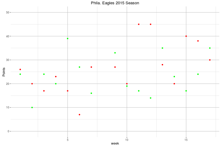
This first graph is a simple scatterplot of their season.  The red dots are their opponent's score, and the green dots are their own score.

To break things down a little more, the next two graphs are bar graphs showing the Eagles' Points For and Points Against, with a horizontal line showing the average points for each graph.  Also, the bars are colored according to the games result: green for a win, red for a loss.


Finally, to illustrate some of the interaction I created the following two scatterplots that show the interaction between Offensive Yards Gained and Points For, and Defensive Yards Allowed and Points Against:


This was just a quick visualization of the the Eagles 2015 season.  A more detail analysis would include a break down of offensive and defensive total yards into their component parts (passing and rushing), and additional variables such as penalties and turnovers.


Monday, February 29, 2016

Continuing Research on U.S. Gasoline and Crude Oil Prices, Part Four

A Brief Digression...

UPDATE: 29 Feb 2016

Due to some font and formatting problems (pointed out by a reader), I had to update this blog post to fix the OLS regression output tables below.  I am going to see if I can "pinch and tweak" some of the formatting to see if that will help with future posts of this kind.  -Rich

A quick note before I continue on with, and conclude, my blog series on gasoline and oil prices: I know that the spacing of my blog looks off in some spots.  Despite my efforts to make spacing uniform, things do not come out quite correctly.  I apologize.  To help get my R output spacing to be more uniform, I installed the stargazer package developed by Marek Hlavac.

I am concluding this topic with this post.  Here are links to my previous three posts in case you need/want to go back to them: [1], [2], and [3].


Modeling The Data


With much of the exploratory analysis complete, I will continue my analysis by performing several ordinary least-squares (OLS) regressions on the data.  The results are below:


1. OLS Regression of the non-differenced price data

=============================================================================================
                                               Dependent variable:                           
                    -------------------------------------------------------------------------
                                                   avgConvGas                                
                              (1)                     (2)                      (3)           
---------------------------------------------------------------------------------------------
wti                          0.052                 1.108***                                  
                            (0.085)                 (0.050)                                  
                                                                                             
brent                      0.928***                                         0.968***         
                            (0.070)                                          (0.024)         
                                                                                             
Constant                   0.244***                  0.109                  0.263***         
                            (0.062)                 (0.103)                  (0.054)         
                                                                                             
---------------------------------------------------------------------------------------------
Observations                  96                      96                       96            
R2                           0.945                   0.841                    0.944          
Adjusted R2                  0.943                   0.840                    0.944          
Residual Std. Error     0.131 (df = 93)         0.221 (df = 94)          0.131 (df = 94)     
F Statistic         793.560*** (df = 2; 93) 498.330*** (df = 1; 94) 1,597.500*** (df = 1; 94)
=============================================================================================
Note:                                                             *p<0.1; **p<0.05; ***p<0.01

Looking at the univariate regression output above, we see that the WTI crude spot price and the Brent crude spot price are statistically significant in the models where they are the sole independent variables -- see the output in the table columns (2) and (3).  In the multivariate model regression output in which they are both independent variables -- table column (1) -- the WTI crude spot price is no longer statistically significant.  Even though the coefficient for the WTI crude spot price is greater than zero in that model, at the 95% confidence level it could be zero in the model because zero falls within that range of values.


2. OLS Regression of the differenced price data


===========================================================================================
                                              Dependent variable:                          
                    -----------------------------------------------------------------------
                                                    diffGas                                
                              (1)                     (2)                     (3)          
-------------------------------------------------------------------------------------------
diffWTI                     0.394**                1.043***                                
                            (0.181)                 (0.077)                                
                                                                                           
diffBrent                  0.706***                                        1.067***        
                            (0.181)                                         (0.073)        
                                                                                           
Constant                    -0.003                  -0.002                  -0.004         
                            (0.012)                 (0.013)                 (0.012)        
                                                                                           
-------------------------------------------------------------------------------------------
Observations                  95                      95                      95           
R2                           0.710                   0.661                   0.695         
Adjusted R2                  0.703                   0.658                   0.691         
Residual Std. Error     0.116 (df = 92)         0.125 (df = 93)         0.119 (df = 93)    
F Statistic         112.357*** (df = 2; 92) 181.580*** (df = 1; 93) 211.444*** (df = 1; 93)
===========================================================================================
Note:                                                           *p<0.1; **p<0.05; ***p<0.01

In the regression output from the differenced values of the WTI and Brent crude spot price, the univariate models are both statistically significant, similar results to the non-differenced variable regression output.  However, in the multivariate model of the differenced values, WTI crude spot price is statistically significant.

The conclusion I would draw from this is that WTI crude oil spot price is less significant than Brent crude oil spot price in regards to the U.S. gasoline spot price, but that it does have a share of the significant effect on the change in U.S. gasoline spot price.


Causal Analysis


Finally, I used the grangertest() function in R in order to perform a causal analysis on both the non-differenced and the differenced variables.  This test looks for the causal relationship between the variables, like the age old question of which came first: the chicken or the egg.  In the output below, I am including the results that were found to be statistically significant.  (For the full run of Granger causality tests, please see my R script.)


1. Granger Causality Tests on the non-differenced price data


The two statistically significant results were that both WTI and Brent crude spot prices Granger cause the U.S. gasoline spot price:


Granger causality test
Model 1: avgConvGas ~ Lags(avgConvGas, 1:1) + Lags(c(wti + brent), 1:1)
Model 2: avgConvGas ~ Lags(avgConvGas, 1:1)
  Res.Df Df      F Pr(>F)  
1     92                   
2     93 -1 3.9445   0.05 .
---
Signif. codes:  0 ‘***’ 0.001 ‘**’ 0.01 ‘*’ 0.05 ‘.’ 0.1 ‘ ’ 1

... and that the Brent crude spot price Granger causes U.S. gasoline spot prices:

Granger causality test
Model 1: avgConvGas ~ Lags(avgConvGas, 1:1) + Lags(brent, 1:1)
Model 2: avgConvGas ~ Lags(avgConvGas, 1:1)
  Res.Df Df      F   Pr(>F)   
1     92                      
2     93 -1 10.184 0.001938 **
---
Signif. codes:  0 ‘***’ 0.001 ‘**’ 0.01 ‘*’ 0.05 ‘.’ 0.1 ‘ ’ 1
Based on the p-values of the probability values (Pr(> F)) of the F tests in the output above shows us that the Brent crude oil spot price does Granger cause U.S. gasoline spot prices -- with a significance well within the 95% confidence level.  In the multivariate model, both WTI and Brent crude spot prices can be said to Granger cause U.S. gasoline spot prices.  However, when I combine these results with the linear regression results above, I would say that the WTI spot price is not significant in the multivariate Granger test results and that it weighs down the effects of the Brent spot price. 

2. Granger Causality Tests on the differenced price data


The statistically significant results for the differenced data was slightly different.  The multivariate model results were not significant within the 5% confidence level (but were significant within the 10% confidence level.)


The model that was statistically significant again showed that Brent crude oil spot prices Granger cause U.S. gasoline spot prices:


Granger causality test
Model 1: diffGas ~ Lags(diffGas, 1:1) + Lags(diffBrent, 1:1)
Model 2: diffGas ~ Lags(diffGas, 1:1)
  Res.Df Df      F  Pr(>F)  
1     91                    
2     92 -1 4.0147 0.04808 *
---
Signif. codes:  0 ‘***’ 0.001 ‘**’ 0.01 ‘*’ 0.05 ‘.’ 0.1 ‘ ’ 1

Conclusion


To bring this blog series to a close, the simple conclusion that I draw from my research and analysis is that U.S. gasoline spot prices are more influenced by the Brent crude spot price than by the WTI crude spot price.  During my thesis research, the work of Dr. Phillip K. Verleger, Jr. that is listed below in the references played a large role.  In the article "The Margin, Currency, and the Price of Oil", Dr. Verleger explores the hypothesis that the Brent crude oil price represents the marginal market for oil.  I believe that my research and analysis replicates his work and results.


The interesting thing to watch in the coming months is whether or not the marginal market will move now that the U.S. has lifted its ban on the export of crude oil. 


References:


  1. "U.S. gasoline prices move with Brent rather than WTI crude oil," U.S. Energy Information Agency, November 3, 2014. http://www.eia.gov/todayinenergy/detail.cfm?id=18651.
  2. Nathan S. Balke, Stephen P. A. Brown, Mine K. Yucel, "Crude Oil and Gasoline Prices: An Assymetric Relationship?" Federal Reserve Bank of Dallas. Economic Review, First Quarter 1998. https://www.dallasfed.org/assets/documents/research/er/1998/er9801a.pdf.
  3. Clive W. J. Granger, "Investigating Causal Relations by Econometric Models and Cross-Spectral Methods," Econometrica, vol. 37, no. 3, Aug 1969, pp. 424-38. http://www.jstor.org/stable/1912791
  4. James H. Stock and Mark W. Watson, Introduction to Econometrics, 2nd ed. Boston: Pearson, 2007.Introduction to Econometrics
  5. Philip K. Verleger, Jr., "The Determinants of Official OPEC Crude Prices," The Review of Economics and Statistics, vol. LXIV, no. 2, May 1982. Retrieved December 6, 2014. http://www.jstor.org/.
  6. Philip K.Verleger, Jr., "The Margin, Currency, and the Price of Oil," NABE Business Economics, vol. 46, no. 2, 2011. http://www.nabe.com/pubs.
  7. Philip K. Verleger, Jr., "How Wall Street Controls Oil," The International Economy, Winter 2007. http://www.international-economy.com/TIE_W07_Verleger.pdf.


For the articles that are freely available, a direct link is given.  For articles that required membership access, a link to the publishing website is given.

Sunday, February 7, 2016

Using ShinyApps, Learning Python...

The past two months have been very busy, both at work and at home, so I have not had much free time to devote to a new project.

I did finish the last course in the Data Science specialization (Developing Data Products) on Coursera.  In that course, I created an application using RStudio's Shiny framework.  You can check it out on the Shiny Apps website.  I plan to use my Shiny account as a complement to this blog because it makes great interactive graphical output.  In regards to the Data Science certificate program, all that is left for me to earn the specialization certificate is the Capstone course, which starts on 7 March.

I have also started taking the courses in the Python for Everybody series (to earn that specialization certificate) as a crash course in programming with Python before I start the Machine Learning specialization certificate courses this summer.

As my schedule settles down over the course of the month, I will have time to work on some of the ideas that I have for data analysis projects.  Stay tuned!

Sunday, December 6, 2015

Continuing Research on U.S. Gasoline and Crude Oil Prices, Part Three

Continuing on with the work in my previous two posts [1] [2], I will explore the possibility that the data exhibit a unit root by using the urca package in R.  Having already established that the data exhibit significant signs of autocorrelation, checking for unit root (with and without a drift) is another step in the process of working with time series data -- and financial data falls into this category.

For each Augmented Dickey-Fuller (ADF) test looking for unit root, done using the ur.df() function within the urca package, I am including a graph of that variable as a visual reference:

1. The averaged price of U.S. Conventional Gasoline prices


> gasADFtest <- summary(ur.df(avgConvGas, 
                              type = "drift", 
                              selectlags = "BIC"))

> gasADFtest

############################################### 
# Augmented Dickey-Fuller Test Unit Root Test # 
############################################### 

Test regression drift 


Call:
lm(formula = z.diff ~ z.lag.1 + 1 + z.diff.lag)

Residuals:
     Min       1Q   Median       3Q      Max 
-1.08395 -0.10528  0.01245  0.13314  0.31021 

Coefficients:
            Estimate Std. Error t value Pr(>|t|)    
(Intercept)  0.24809    0.08949   2.772  0.00675 ** 
z.lag.1     -0.10241    0.03706  -2.764  0.00692 ** 
z.diff.lag   0.39773    0.09582   4.151 7.45e-05 ***
---
Signif. codes:  0 ‘***’ 0.001 ‘**’ 0.01 ‘*’ 0.05 ‘.’ 0.1 ‘ ’ 1

Residual standard error: 0.1941 on 91 degrees of freedom
Multiple R-squared:  0.1881, Adjusted R-squared:  0.1703 
F-statistic: 10.54 on 2 and 91 DF,  p-value: 7.616e-05


Value of test-statistic is: -2.7637 3.8806 

Critical values for test thestatistics: 
      1pct  5pct 10pct
tau2 -3.51 -2.89 -2.58
phi1  6.70  4.71  3.86


2. The West Texas Intermediate crude oil spot price


> wtiADFtest <- summary(ur.df(wti, 
                              type = "drift", 
                              selectlags = "BIC"))


> wtiADFtest

############################################### 
# Augmented Dickey-Fuller Test Unit Root Test # 
############################################### 

Test regression drift 


Call:
lm(formula = z.diff ~ z.lag.1 + 1 + z.diff.lag)

Residuals:
     Min       1Q   Median       3Q      Max 
-0.47603 -0.08486  0.01266  0.10034  0.34917 

Coefficients:
            Estimate Std. Error t value Pr(>|t|)    
(Intercept)  0.19902    0.07044   2.825  0.00580 ** 
z.lag.1     -0.09557    0.03394  -2.816  0.00596 ** 
z.diff.lag   0.47096    0.09296   5.066 2.11e-06 ***
---
Signif. codes:  0 ‘***’ 0.001 ‘**’ 0.01 ‘*’ 0.05 ‘.’ 0.1 ‘ ’ 1

Residual standard error: 0.147 on 91 degrees of freedom
Multiple R-squared:  0.2432, Adjusted R-squared:  0.2265 
F-statistic: 14.62 on 2 and 91 DF,  p-value: 3.123e-06


Value of test-statistic is: -2.8159 4.0264 

Critical values for test statistics: 
      1pct  5pct 10pct
tau2 -3.51 -2.89 -2.58
phi1  6.70  4.71  3.86


3. The Brent crude oil spot price


brentADFtest <- summary(ur.df(brent, 
                                type = "drift", 
                                selectlags = "BIC"))

> brentADFtest

############################################### 
# Augmented Dickey-Fuller Test Unit Root Test # 
############################################### 

Test regression drift 


Call:
lm(formula = z.diff ~ z.lag.1 + 1 + z.diff.lag)

Residuals:
     Min       1Q   Median       3Q      Max 
-0.42331 -0.07683  0.02460  0.10103  0.35226 

Coefficients:
            Estimate Std. Error t value Pr(>|t|)    
(Intercept)  0.14981    0.06196   2.418   0.0176 *  
z.lag.1     -0.06661    0.02777  -2.399   0.0185 *  
z.diff.lag   0.48010    0.09208   5.214 1.15e-06 ***
---
Signif. codes:  0 ‘***’ 0.001 ‘**’ 0.01 ‘*’ 0.05 ‘.’ 0.1 ‘ ’ 1

Residual standard error: 0.147 on 91 degrees of freedom
Multiple R-squared:  0.2468, Adjusted R-squared:  0.2302 
F-statistic: 14.91 on 2 and 91 DF,  p-value: 2.509e-06


Value of test-statistic is: -2.399 2.9484 

Critical values for test statistics: 
      1pct  5pct 10pct
tau2 -3.51 -2.89 -2.58
phi1  6.70  4.71  3.86


Based on reviewing the visualized graphs, I chose to use the type = "drift" option in the ur.df() function.  I do not believe that any strong signs of a trend exist in the data, but I do believe that it is appropriate to treat it for a drift term.  I also used the Bayesian information criteria in order to select the lags used with the selectlags = "BIC" option -- which selected a lag of one (1) for the ADF test.

For each variable, the ADF test shows that we can not reject the null hypothesis that the variable has a unit root.  At the bottom of each test is the ADF test statistic and the ADF test critical values.  In all cases, we can not reject the null hypothesis at the 5-percent significance level, labeled 5pct,  and only for the average gasoline price and the WTI crude price are they significant at the 10-percent (10pct) significance level.  For the purposes of my research and this blog post, I am going to assume that each variable exhibits has a unit root.  The regressions in each test shows the significance of the intercept, lagged term, and the drift component, all of which are statistically significant within the 5-percent significance level.

From here, I will continue my research using the first difference of each variable.  The plots below are for each variable, now in a first-difference form.:


These first-differenced variables make the data stationary about a mean of zero (or near to it, which can be checked by summarizing the variables with summary()) and will aid in performing an accurate causal analysis, which I will perform in my next post.  I plan to conclude this series with my next blog post and make a final update to my GitHub repository for this work as well as list the works I used in the course of my original research, when this was my thesis project.

Wednesday, November 4, 2015

Continuing Research on U.S Gasoline and Crude Oil Prices, Part Two

Exploratory Analysis, cont'd.

In my previous post, I began to explore the relationship between the spot prices of West Texas Intermediate (WTI) crude oil and Brent crude oil with the average of the spot prices of conventional gasoline in the New York  and Gulf hubs.

To continue with my analysis, the question of whether or not there was a statistically significant difference between the dollar-per-gallon price of WTI and Brent crude oil should be addressed.  The first thing I did was create a boxplot of the two price variables:


You can see that the range of the prices are about the same, and the means appear to be only slightly different.  Just to be sure, however, I calculated the confidence interval between the two means using the assumption that the variances were unequal (which they are) and then testing the hypothesis that the difference between the mean prices is zero:

Lower C.I., 95% | Upper C.I., 95% 
   -0.008423387 |     0.280491840 


t-stat, 189.208df | comparative t-stat | comparative p-value
            1.973 |           1.857953 |          0.03236876

So, you can see that the confidence intervals of the difference of the means includes zero, ranging from just more and negative (-) $0.01 to $0.28.  The hypothesis test allows me to have confidence in my decision to not reject the null hypothesis -- which appear to not be statistically significantly different from one another.

However, we know that the two prices are viewed as significantly different in the market, so further exploration is necessary.  First is to check for randomness because it is a basic assumption in statistical modelling; and, if the data are not random, than any statistical tests comparing them may produce questionable results.  For this task, I looked at the autocorrelation and partial autocorrelation of the WTI and Brent crude oil spot prices and the averaged conventional gasoline spot price:


The top row of plots are the autocorrelation plots, which suggest that there is a moderate autocorrelation between the variables and their respective lagged values.  The data do not exhibit randomness and we can infer that the current month's price has a correlation with its own lagged values.

The second row of plots are the partial autocorrelation of the variables in this analysis.  This can be used to find the appropriate lag order for the modeling to be done in the next step of my analysis.  In this case, it appears that the first and second lags are statistically significant for all of the variables (wti, brent, and avgConvGas) and only WTI data has a lagged value beyond that, and that only the third lagged value.

So, it would appear that an appropriate course of action would be to use an autoregressive model, AR(2), for all three variables and an additional model for WTI modeled as an AR(3).

----------------------------------------------------------------------------------------

I'm going to conclude this entry here.  I will continue in my analysis in my next post, which will include moving on to actually modelling the data.

EDIT (05 Nov 2015): I uploaded my R script and dataset to my GitHub account so that it is available for everyone.  I will be updating it as I go along, with the final submission sent when I conclude my work in this blog series.

Sunday, September 27, 2015

Continuing Research on U.S. Gasoline and Crude Oil Prices, Part One

Preface

The next several posts will contain a brief version of the exploratory analysis that I had performed for my final research project (thesis) while I was enrolled in a Masters program in Applied Economics.  The overall goal was to quantify the causal relationship between U.S. gasoline prices and spot crude oil prices -- both West Texas Intermediate (WTI) and Brent.

All of my data comes from the U.S. Dept. of Energy's Energy Information Agency (EIA).  A lot of the initial transformation of the data, such as picking the time frame and choosing which variables to include, was done in LibreOffice Calc.  Originally, the statistical analysis had been done in Stata12, but since migrating myself to R I have done most of my work over again.

The data and R script will be made available in my GitHub account, a link is available on the right-hand side of the page.

Introduction

Crude oil is a heavily traded commodity that garners a lot of attention.  The question that I ultimately would like to answer is: What is the relationship between crude oil and U.S. gasoline prices, and is it quantifiable in some manner?

First, I chose an eight year time period of data from the EIA's publicly available data, beginning in July 2006 and ending in June 2014.  The first part of my analysis focuses primarily on WTI and Brent crude oil spot prices and the simple average of the U.S. Conventional Gasoline prices from the New York and Gulf hubs.  (i.e.: (Conv. Gas NY + Conv. Gas Gulf) / 2)

Exploratory Analysis

Foregoing summary statistics, I will begin by visualizing the data:


From this simple line plot, it looks like the average Conventional Gasoline price tracks closer to the Brent crude oil price than the WTI price.  So this graph is followed up with the correlation between the variables, using the cor() function in R:

                 wti     brent avgConvGas
wti        1.0000000 0.9385743  0.9172266
brent      0.9385743 1.0000000  0.9718169
avgConvGas 0.9172266 0.9718169  1.0000000

From the table above you can see that the two crude oil prices are highly correlated (orange highlighting) with each other, which is not a surprise given the global nature of the crude oil market.  We also see that the two market crude oil prices are highly correlated with the gasoline prices -- again, not a surprise since gasoline is derived from crude oil via the refining process -- but U.S. Conventional Gasoline prices are more correlated with the Brent crude oil price (blue highlighting) than the WTI crude oil price (green highlighting).

...


I'm going to stop here.  I will continue my analysis in Part Two of this post.  Stay tuned!


Monday, August 17, 2015

Alcoa vs. Aluminum

For your reading pleasure, I am submitting a brief analysis of Alcoa's stock price -- as listed on the NY Stock Exchange (NYSE) -- and the London Mercantile Exchange's price for aluminum.

Before I do, I wanted to let whomever may be reading that I have updated my blog a bit with links to other blogs and sites that I frequent, as well as a link to my GitHub account.

... and, my GitHub account now has a repository for the blog that contains my R scripts and data. The README.md file explains the pertinent details.

As for my blog post, all of my data comes from Quandl.  If you haven't done so, you can sign up for an account for free. This will give you easier access to their data.

I decided to go with a year-to-date approach for my analysis.  Alcoa's stock price hasn't been all that great this year, as you can see here:

... it's lost roughly one-third of its value over the course of the year.  So, I looked up the settlement prices (the "cash" or spot price) of aluminum on the LME:

Visually, there is a noticeable correlation.  After controlling the two datasets for commonly shared dates -- U.S. markets and UK markets have some operating differences -- I was able to transform the data to make them comparable.  The correlation between the datasets is roughly 85%.

At first this may appear natural, but the relationship would make more sense if it were the opposite.  One would expect the Alcoa share price to go up as the price of aluminum goes down, since their costs would go down.  To see if the law of supply and demand were working with that assumption, I then downloaded the stock quantities of aluminum that LME has warehoused around the world.


There is a noticeable decrease in quantities of aluminum (both "primary", or pure, and alloy) being warehoused.  These quantities are closing quantities, defined as the on-hand quantity at the close of business day after deliveries in and out of inventory.  Closing quantities includes open interest quantities and cancelled interest quantities.

The next question that comes to mind is: How is this important?

Simply answered with: It may be a sign that demand for aluminum may be falling... and that may be a sign of weakness in the manufacturing sector.  Aluminum is a pretty common metal and is widely used in manufacturing, so decreasing quantities and prices may be the result of decreased demand.  

To see if this hypothesis is indeed true, I will have to do further research focusing on ore production as well as other companies with operations similar to Alcoa.

Sunday, July 26, 2015

Using RPubs To Publish Work

I need to apologize to anyone who is actually reading my blog.  I had every intention of publishing a follow up post about Greece -- comparing its 10-year bond rates with those of the other "troubled" EU countries of Spain, Italy, and Portugal -- but life got in the way a bit.

This post will be a brief explanation of my current course.  I'm currently in the Reproducible Research course in the Data Science specialization certificate offered through Coursera.

One of the assignments in this course has me working with a particularly messy dataset.  After downloading the data, cleaning it up, and performing some exploratory analysis, I published my findings to RPubs.com.

Here is a link to my report.  It's nothing fancy, but I'm proud of it. 

This was created using the knitr package that integrates nicely with RStudio.  It allows you to create markdown documents that are easily viewable in HTML, as well as publishing them to RPubs, which is maintained by the folks who created and maintain RStudio.

knitr can also create documents in .doc and .pdf format as well.  I recommend trying it if you're in a data analysis role in any compacity.

For now, I'm going to leave off here.

Update 11 December 2015: Due to RPubs documents being public, and not wanting to tempt others who are taking the Data Science specialization through Coursera to copy my work, I have removed the report from RPubs.  I apologize for the inconvenience.

Friday, July 10, 2015

Exploring Greek 10-year Bond Rates

I want to start this blog post with a few notes:
  1. I received some feedback and updated the third graph in my previous post to include a label for the y-axis.
  2. I plan to make my R scripts, data, etc. available through my GitHub account at a later date
  3. I will be adding links to blogs that I follow and websites that I find useful and visit often.
  4. I am hoping to post up something new every other week, but I am not making any promises on creating a schedule for publishing.
This post is the result of a conversation I was having with a coworker.  We were discussing the continued financial woes of Greece when he looked up the Greek 10-year bond rate.  It was not extraordinarily high, giving it recent history.  So, I decided to look up the data through Quandl and see what was available.  I had free access to a premium data set, and pulled the data straight into R using the "Quandl" package.

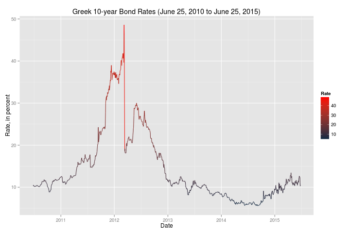
First, here is a historical look at Greek 10-year bond rates:


This plot was made using the "ggplot2" package.  Current rates (around the 10% range) are not particularly bad when compared to 2012 and 2013.  It did appear to have a steep increase from the beginning of 2015 to the last observed data point.

Then, I created another plot using a narrower time frame to focus on more recent events following the 2008 financial crisis:


These plots (and their data) made me wonder if the market was really reacting to the problems in Greece.

The caveat to these plots, however, is that the last captured observation was June 25, 2015.  Quite a lot has happened since then, so I went to Investing.com and pulled data for the trading days of June 25, 2015 through the close of business July 10, 2015:


We can see that there was a jump in the Greek 10-year bond rate that corresponds to the referendum that took place, and the market's reaction to the referendum's outcome.

I took this data and then combined it the data I retrieved from Quandl and created this final plot:


I started working on this blog on Tuesday, and was hoping that Quandl would have updated data -- I am slightly hesitant to append one (very small) data set to another that come from two different sources.  Investing.com's data is not formatted for download.  I had to manually collect the data from their site in order to create that data set.

Regardless, it leads to a few questions:
  1. If rates are a sign of risk, how worried was the market in the Greek referendum?  (The spike is less than half of the larger spike in 2012.)
  2. How will this weekend's continued negotiations affect Greek bond rates?
  3. Like everyone watching events unfold, what would happen if Greece left/were removed from the EU?  Or stopped using the Euro and reintroduced the Drachma?
Continued research could answer those questions.

Sunday, June 28, 2015

First Post

I'm trying to blog in order to exercise my R skills and as an outlet for my own interest in data analysis... or data science, since that's the new "buzz term".

I'm using R (currently, version 3.2.1) and RStudio (currently, version 0.99.441) on an "aging" Acer Aspire TimelineX laptop running Linux Mint 17 'Qiana' for its operating system (OS).

So, for my first post, I'm analysing data that I had previously looked at using Stata12.  Since migrating to R, I'm finding that the graphical output is much better.  Please note that the following graphs are using the base graphics package.

My first plot is Weekly U.S. Retail Gasoline Prices:


Followed by Weekly U.S. Total Stocks:


These are exploratory graphs.  I am just viewing the data.  The price data will probably show a strong correlation with oil prices (which I will show in a later post).  The stock quantities graph looked interesting, so I created a more detailed graph using the 'ggplot2' graphics package:


There was an interesting decrease in the quantities of gasoline stocks that began around 1992 through 1996.  Quantities of gasoline stocks did not show an increase until 2007.  This may be worth exploring further.
Creative Commons LicenseJust A Data Geek Blog by Richard Ian Carpenter is licensed under a Creative Commons Attribution-NonCommercial-ShareAlike 4.0 International License.